Indira IVF is one of India's largest fertility care chains. We led a digital transformation for IVF care, designing a patient-facing mobile application (PWA) that replaced a manual, paper-heavy journey with a connected, digital experience empowering over 17.9 lakh patients across 200+ clinics to navigate their treatment with clarity and ease, while giving Indira IVF the tools to deliver personalized care at scale.
UX RESEARCH
Mobile app design
Website Design
Design system
What Were the Key Challenges?
01
Digitizing the Manual IVF Ecosystem
IVF care relied on manual records and fragmented touchpoints across doctors, patients, and hospitals. The challenge was to map end-to-end workflows and unify them into a centralized, digital eco-system for both urban and rural users
02
Bringing Empathy to a Clinical Journey
IVF is emotionally demanding, yet digital experiences often feel cold and clinical. The challenge was to design a warm, human interface that feels supportive and comforting throughout the journey
03
Navigating the Complex IVF Journey with Clarity
IVF is a multi-stage, paper-heavy journey with scattered reports, prescriptions, and bills. The challenge was to transform this into a clear, stage-based digital experience that keeps patients informed and organized
What was the Objective?
The objective was to build a patient-centered IVF tracking app rooted in convenience, transparency, and proactive support. Beyond simplifying the journey, the experience aimed to support patients’ emotional well-being through tailored content, step-by-step guidance, and playful, reassuring interactions designed to ease anxiety all while seamlessly integrating with patient data from Indira IVF’s Hospital Information System (HIS).
The IVF UX Research - Listening, Learning, Defining
Why research mattered?
For most couples, IVF isn’t just a medical procedure; it’s months of uncertainty, hope, and quiet anxiety, often navigated with very little clarity about what happens next. Designing for this journey meant going far beyond screens and flows; it meant understanding the emotional weight patients carry at every step. So that’s where we started: not with wireframes, but with a framework built to hold that weight.
The Research Approach
For Indira IVF, we adopted a structured design approach – Strategy, Structure, Design, Feelings, and Test to ensure research insights didn’t just shape a functional product, but one that felt trusted, human, and understood.
Each stage played a distinct role in shaping the experience:
Strategy – We began with planning, research, and insights to understand what patients actually needed before a single screen was designed.
Structure – Those insights were organised into logical groupings and an information architecture that reflected how patients think, rather than how hospital systems are typically built.
Design – Navigation, UX writing, wireframes, and interactions translated those insights into a clear and intuitive experience.
Feelings – We addressed the emotional weight of IVF through thoughtful visuals, trust-driven emotional design, and moments of delight that made the experience feel human rather than clinical.
Test – Finally, real patient feedback and usability testing helped validate the experience and ensure it worked for the people it was designed for.
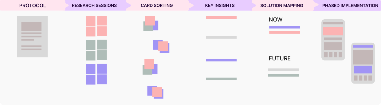
This framework naturally shaped how we planned the research itself, moving from understanding what we needed to learn to translating those findings into clear product decisions and implementation priorities.
The Research Process
With the research framework in place, the next step was to define what we needed to learn from the from the clinical process and patient behaviour to emotional barriers and the wider fertility-care landscape
Methodology
Clinical research – Map the end-to-end IVF treatment protocol, clinical workflow, and patient touchpoints
Patient research – Understand urban and rural patient behaviour, emotional barriers, and treatment experiences
Competitive research – Benchmark healthtech and D2C wellness apps such as Tata 1mg and Traya for UX patterns
Market validation – Validate research findings against fertility-care market research reports and decision-making trends
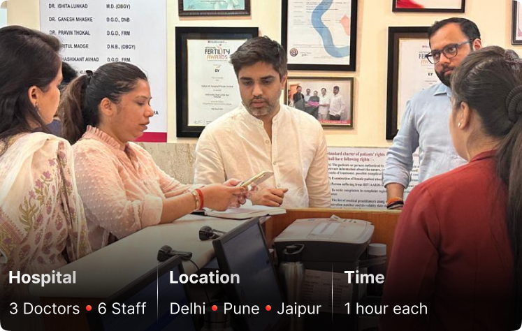
We approached this from the clinic outward. We began with stakeholder sessions and 9 interviews with doctors and hospital staff across Jaipur, Pune, and Delhi, mapping the end-to-end IVF protocol from UHID generation, stimulation, trigger shot, ovum pickup, and embryo transfer to pregnancy testing, payment milestones, and counselling touchpoints.
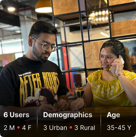
We then moved to 1:1 patient interviews across urban and rural cohorts (ages 35–45), uncovering experiences around self-administered injections, failed-cycle distress, privacy concerns, and payment confusion. Finally, we benchmarked these findings against competitor healthtech apps and healthtech market research reports to identify broader patterns and validate what we learnt.
We Discovered: What Mattered Most?
Bringing together stakeholder interviews, patient conversations, and market research surfaced a rich set of insights – some specific to a single lens, others validated repeatedly across every group we spoke to.
Ecosystem insights: Stakeholder interviews with doctors and hospital staff helped us understand that staggered payments, mandatory post-cycle counseling, and financing gaps weren’t isolated friction points, they pointed to a deeper, unmet need for financial and process transparency across the treatment journey.
Patient insights: Through 1:1 interviews across urban and rural cohorts, we uncovered two very different lived experiences – urban patients battling unawareness, failed-cycle frustration, and privacy concerns, while rural patients navigated misconceptions, language barriers, and stigma. Different segments, but the research validated the same underlying need: support that meets patients where they are.
Shared insights across segments: Analysing patterns across both cohorts confirmed that process clarity, saved time, organised records, financial aid, and a lighter, less clinical experience they were not segment-specific; they appeared consistently across the patient groups we spoke to.
Competitive & market insights: Benchmarking against healthtech apps revealed how dynamic UI patterns, playful visual language, and trust-building success stories drive engagement, a finding further reinforced by market research into decision paralysis and emotional disconnect in fertility care, confirming that trust and warmth needed to be designed in, not assumed.
These weren’t just isolated data points; together, they formed a clear, evidence-backed set of insights that defined the problems the product needed to solve.
Our Solution: The 6 Design Pillar
Feelpixel’s solution was shaped by six design pillars, each answering a specific insight from the research:
Convenience – appointments, teleconsultation, medicine ordering, and payments in one seamless flow.
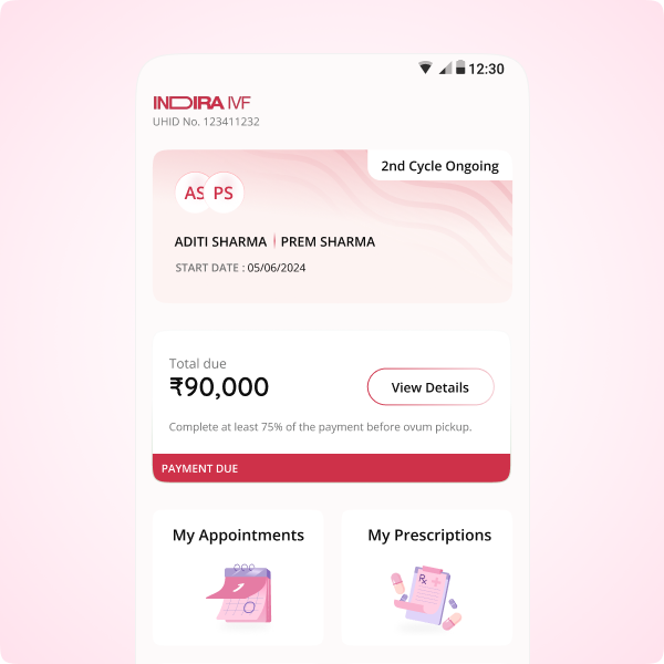
Transparency – real-time visibility into treatment progress and payment dues.
Pro-activeness – the app anticipates the next step instead of patients chasing information.
Emotionalisation – regional-language, empathetic content that meets patients where they are.
Education – IVF stage-specific video content and advice, success stories, and counselling access to replace fear with clarity.
Playfulness – calm colours and light UX writing to soften an otherwise clinical journey.
With six pillars in place, the next step was turning them into an actual product roadmap. Every feature was mapped to a pillar, then prioritised by impact and urgency; must-haves shipped in phase one, with enhancements layered into subsequent releases for deeper personalisation over time; a process our team at Feelpixel refined through close collaboration with Indira IVF’s stakeholders & product teams.
From there, our focus shifted to two key design priorities:
Defining a visual language : Establishing a warm, reassuring design style that could soften the clinical nature of IVF and make the experience feel more human.
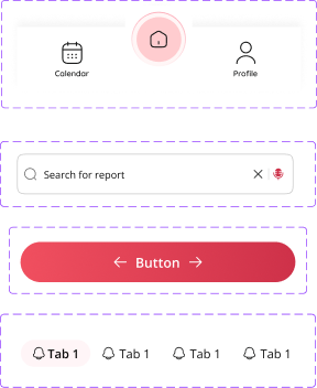
Building a scalable design system : Creating consistent components, styles, and patterns that could support the product as it evolved, expanded, and moved into future releases
Design Style
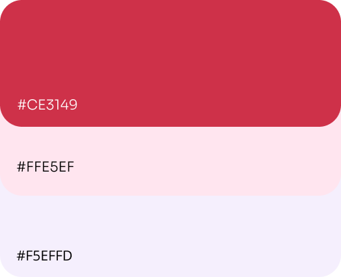
Given how overwhelming IVF can already feel, the Feelpixel design team made sure every visual choice had a job to do- reassure, and simplify. We evolved Indira IVF’s existing brand guidelines with warmer colours to feel comforting rather than sterile, gentler typography to feel conversational rather than clinical, and playful visual touches that bring a sense of ease into a serious journey. Alongside this, we built a reusable system of components and patterns that brought consistency across the product and made it easier to scale new features without starting from scratch.
Custom Illustration
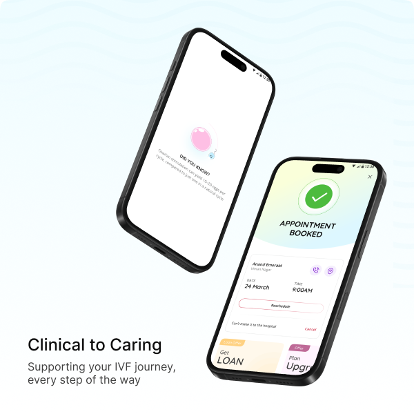
To make IVF onboarding feel more playful and approachable, we moved beyond stock visuals and created custom illustrations, tailored icons, and spot visuals specifically for the journey. Subtle animations brought them to life, adding small, human touches that transformed the first interaction from clinical and intimidating into a warmer, more welcoming experience.
Designing a Unified, Empathetic IVF Ecosystem
We digitized fragmented IVF workflows by mapping manual touchpoints and translating on-ground workflows into structured digital flows. Key interactions-appointments, milestones, reports, and communication-were centralized into one platform, replacing paper records, WhatsApp updates, and verbal follow-ups. The solution balanced clinical precision with empathy, delivering real-time visibility, clear ownership, and traceable data, while remaining accessible for both urban and rural users and significantly reducing hospitals’ reliance on manual coordination.
Designing Care Beyond the Clinic
Recognizing the sensitivity of the IVF journey, we designed the experience to feel warm, human, and reassuring rather than clinical. Soft visuals, compassionate microcopy, and gentle interaction states created a sense of comfort and trust at every step. The interface encouraged patients to engage with confidence, turning a stressful medical process into a supportive, emotionally grounded journey that reflected genuine care, even outside the clinic walls.
Turning Complexity into Clarity & Confidence
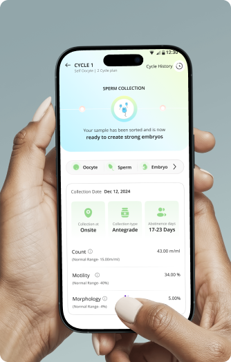
To simplify the multi-stage IVF journey, we designed a stage-wise tracker that visually maps each phase of treatment into a single, organized flow. Thoughtful illustrations, guided interactions, and simple language broke down medical complexity, making progress easy to understand and less intimidating. Scattered information became a clear, structured journey – empowering patients with confidence while strengthening engagement for the clinic.
From Design to Seamless Development
Weekly dev hand-off meetings kept the Feelpixel design team and development team closely aligned – flows were explained, queries resolved, and every screen validated against real system capabilities, data formats, and technical feasibility. This close collaboration allowed both teams to refine designs with precision as development progressed, while every revision was tracked through clear versioning and sequential dev notes.
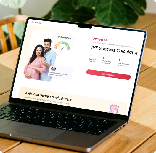
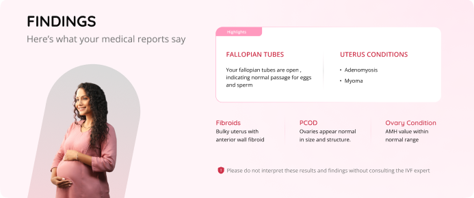
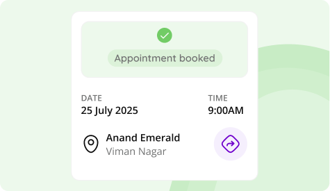
Feelpixel designed an IVF Success Calculator for web and mobile-web (website/m-site) to give patients a personalized, data-backed sense of their chances before treatment begins. With flows built for patients with and without prior medical reports, it factored in age, medical history, and previous attempts to generate probability scores across multiple IVF cycles, delivered through simple visuals and supportive language that built confidence rather than anxiety. Launched on 25 July 2025 (World IVF Day), the calculator drove 8,700 landing page visits,4,200 result views, and hundreds of leads within the first two weeks.
AI Web BOT, Accessibility Amplified
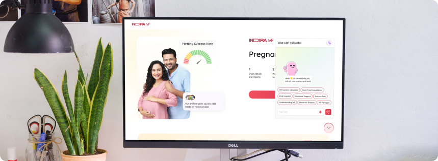
Feelpixel crafted an inclusive, multilingual AI-powered IVF Chatbot for both urban and rural patients with language switching and audio input for those more comfortable speaking or engaging in regional languages. It handled appointment booking, emergency contacts, stage-wise IVF information, packages, centers, videos, tips, and emotional support, guided by quick-chip navigation and smart drop-off handling to keep conversations flowing and leads converting. Launched on Friday, 9 January 2026, the bot engaged thousands of users and began generating leads within its first week.
Usability Testing and Patient Experience Validation
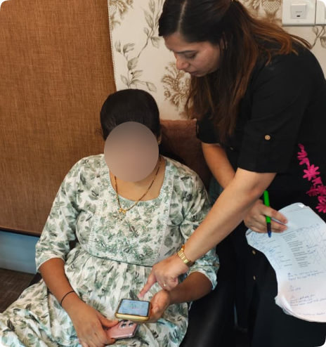
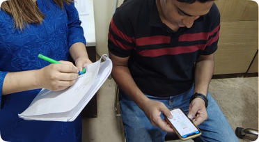
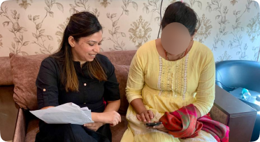
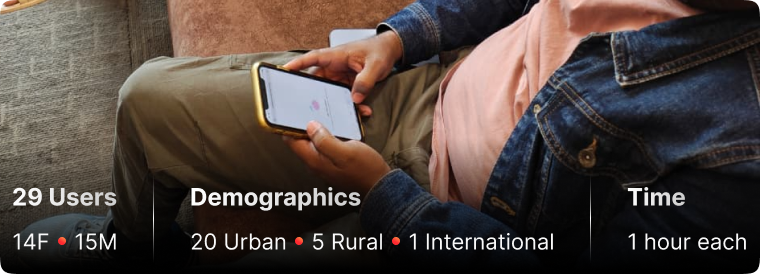
Feelpixel conducted one-on-one usability testing sessions with 29 users-15 men and 14 women, spanning 20 urban, 8 rural, and 1 international participant at the Viman Nagar clinic over 6 days, with ages ranging from 25 to 48. The goal was to observe how patients navigated key design flows and interacted with critical features such as navigation patterns, the IVF stage tracker, and core task flows. Testing helped us validate what was working well while identifying areas of friction, allowing us to further shape the experience around patients’ needs.
These sessions revealed that intuitive navigation and clear, accessible information were building trust, while certain details still needed refinement. For example, patients did not immediately understand the medical term “Gametes” in the cycle tracker, so we replaced it with more familiar terms- Eggs, Sperm, and Embryo. We then validated these changes through further testing, ensuring each gap was addressed before moving forward.
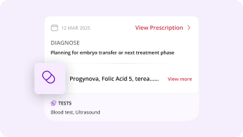
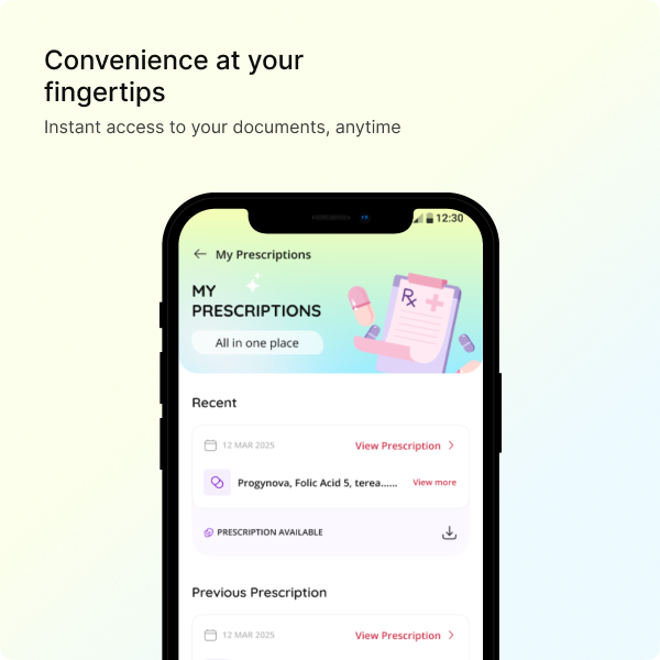
The result was an experience patients could navigate with greater clarity and confidence. Appointment Booking, the Stage Tracker, My Prescriptions, and My Receipts emerged as particularly valuable, especially for outstation and semi-urban patients relying on the app remotely, showing how research-led iterations translated into a patient experience built around features patients genuinely valued.
Defining care through thoughtful design
16% Growth in Registrations
Feelpixel transformed a deeply manual, paper-heavy system into a structured, stage-based digital journey, now scaling to thousands of patients without losing personal context – as digital adoption accelerates alongside patient trust.
98% Report Download Rate
Feelpixel’s thoughtful Thoughtful, patient-first design made report access effortless- 98% of patients who open a report download it, cutting out the hours once lost to hospital visits and waiting, and building trust through the experience itself.
Converting Interactions Into Measured Data
For the first time, we can turn raw app behaviour into findings that shape the product roadmap. For example, with ~1.1M interactions recorded in a single month, we now know patients express roughly 11x more interest in embryo grading than egg retrieval.
Closing the Urban-Rural Gap
Feelpixel thoughtfully crafted the experience to work across varying literacy levels, languages, and digital familiarity, ensuring patients from both urban and rural backgrounds could navigate their treatment with equal ease, clarity, and confidence.
Similar Projects
We crafted an innovative car buying journey with the primary goal of assisting users in reaching a decision on which car to buy through a more visually engaging experience.
Developed an omnichannel experience for Medlife's diverse offerings with customized navigation and a scalable visual design system that aligned with the brand identity.
Elevated their online presence with multi-channel website and mobile app, featuring scalable and user-centered designs for a seamless mobile shopping experience.








 AutomotiveCARS24 NEW CAR
  HealthcareMedlife
  E-commerceBest & Less
  Real EstateAuction Bazaar